Open Innovation Winter 2018

Final Presentation - Uliana and Rosa

Rosa Boehm and Uliana Dukach
1 / 19

The Brief : 

Rosa Boehm

Hoop Skirt 2.0 - A skirt with two layers: a disorderly, multi-colored bottom layer that embodies the chaos of a sandstorm, and a black satin top layer that can hide the chaos. 

The Sand Storm Skirt is a wearable that emulates the chaos of a sand storm while allowing the wearer to control the amount of chaos shown. The skirt consists of two contrasting layers : a top layer made of black satin to show modesty and calmness, and an under layer dyed different colors to represent disarray. This represents a sand storm by contrasting how different a sand storm can be from up close as oppose to being from a further perspective. The skirt shows this by having the wearer control what the viewer sees which shows the different perspectives people have on a sand storm. Furthermore this disparity gives the wearer a sense of power as they can choose to show more or less of the hidden design underneath.  Two strings attached to the sides of top layer of the skirt can be pulled up to reveal the chaotic scene underneath. Instead of having the satin strings drag on the floor, we attached them to the wearer by creating temporary suspenders that lift up the top layer of the skirt but when pulled on, reveal the underskirt. 

The Brief :

Uliana Dukach

The Hoop Skirt 2.0 is a two-layered skirt that shows the contrast between calmness and chaos.

The Hoop Skirt 2.0 skirt is designed to represent how something can look calm and composed on the outside, but on the inside be chaotic and crazy. Hoop SKirt 2.0 shows this contrast in the form of a two-layered skirt. The bottom layer is made out of muslin dyed orange, purple, blue and red and further stamped with colorful rectangles. The top fabric is made out of nine panels of black satin lined with thick interfacing for stiffness the panels are connected to each other by a plastic tube. The user lifts up the top skirt by pulling on some strings that attach to the plastic tube causing the panels to curl up to reveal the chaos of the bottom skirt. 

The Snowman Spin Seat

Alex Shigueta and Leighton Gray


Alex Shigueta:
Snowman Spin Seat: A comfortable hollow snowman that spins when a child climbs inside and provides shelter from the cold Boston winter.

It's common for people in winter climates to experience a form of seasonal depression that keeps them inside, feeling tired and dreading the cold. The Snowman Spin Seat entices people to go outside and enjoy winter while having quality family time and making or bringing back childhood memories of the playground. A child can climb into the hollowed-out body, setting it spinning, and gaze out the head at the winter wonderland. The Spin Seat is built to be large and sturdy enough that it won’t tip over but will still make the time inside entertaining for the child. As Snowman Spin Seats make their way onto playgrounds, more people will discard any preconceptions about the cruelty of winter.

The spin seat relies on a ribbed design that encircles the occupant. Inside there are large pillows positioned inside each intersection point from the perpendicular ribs to make the inhabitant feel cozy. Finally, the outside of the human-size snowman has an HDP constructed ”teardrop” pattern that when layered on top of each other, creates shingles for the snowman. This is done to ensure that no water will be able to get inside the snowman. When the occupant sits down inside, gravity induces the seat to spin around on the center point. The inside grants the user the ability to peer out from the head of the snowman, giving the impression of "embodying" the snowman. Children can imagine themselves to be Frosty the Snowman, or Olaf from Frozen. The Snowman Spin Seat allows people to have fun while also offering warmth in the coldest season. The spherical design pushes wind around the snowman, not into it, offering a cozy retreat from the blustery cold.

Gallery Walk

Luis Carbajal

The Snowman Spin Seat

Alex Shigueta and Leighton Gray

Poster

Davin Izedian


Post_337685

Anara Magavi and Aveen Nagpal

Aveen:

A school magazine that reports on recent happenings at NuVu and pokes fun at the often irrational policies and tendencies of NuVu administration.

Vague magazine reports and reflects on recent happenings at NuVu alongside student-made opinion pieces. For a long time, students at NuVu have joked about having a NuVu reality TV show or magazine and earlier this trimester two students decided it would be fun to create and keep a school magazine. They started working on it in their free time, and a week later the first issue of Vague had been written, printed, and published. They decided it would be better to give it only to select people because a number of private specifics were used in the articles, but somehow an issue reached the coaches. It was not received well because it made fun of and somewhat exposed just how outrageous some of the new rules were. Out of this, Vague magazine was developed as an official NuVu project, designed to report and reflect on recent happenings at NuVu and give space to student opinion pieces.

This new issue of Vague was made to poke fun at the NuVu administration and their often irrational policies and was therefore dubbed "Vague, CENSORED". To honor the exclusivity of the original, some of the publications are "Thicc" editions, referring to their heavyweight front and back covers. To represent the rebellious nature of the magazine, an image of a student on an abandoned bridge was chosen for the cover, with the title "VAGUE" spray-painted across the top. The magazine is made out of three sheets of legal paper folded in half to create four pages from each; the binding is sewn and the covers are silkscreened rather than printed to represent the underground nature of the magazine. In the new issue of the magazine, fewer personal details were used so it could be given to all NuVu students. 

Anara:

Vague: a magazine centered around the Nuvu community, with articles and pages that poke fun at students and coaches, with the aim of informing the reader of current events around Nuvu.

Vague is a magazine centered around the Nuvu community, with an assortment of articles and pages that poke fun at students and coaches. Vague was originally designed as a parody of Vogue, when we changed the goal of the magazine, we still liked the name so we kept it Vague was not inspired by vague in any way other than the name. The cover is a screen-printed image of a person standing on an abandoned bridge, to represent rebellion; over the image is a spray-painted "Vague" in the original Vogue magazine font.

Final presentation

Alex Demidov and Davin Izedian
presi box.jpeg

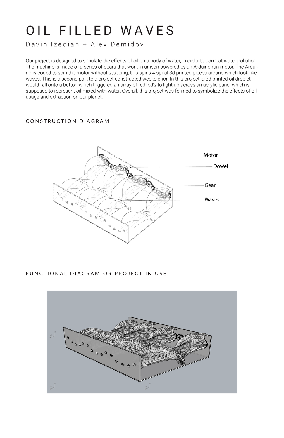
Our project is designed to simulate the effects of oil on a body of water, in order to combat water pollution. The machine is made of a series of gears that work in unison powered by an Arduino run motor. The Arduino is coded to spin the motor without stopping, this spins 4 spiral 3d printed pieces around which look like waves. This is a second part to a project constructed weeks prior. In this project, a 3d printed oil droplet would fall onto a button which triggered an array of red led's to light up across an acrylic panel which is supposed to represent oil mixed with water. Overall, this project was formed to symbolize the effects of oil usage and extraction on our planet.

Dearth of Fish

Ethan Donaldson and Jacob Creem
1 / 16

Jacob Creem: Modern society seems to acknowledge yet forget the detrimental impact humans have on the world's oceans. While many have attempted to turn this cognizance into actual action, the oceans are still suffering drastically. In fact, it is predicted that by 2034 the near 5.25 trillion pieces of micro and macro plastics that currently inundate the world's marine and coral life, will nearly double. In an attempt to make a decisive change, 'A Dearth of Fish' was created; the installation of three coral artifacts aims to remind viewers of the dire state of the oceans by allowing them to compare one beautiful, one bleached and one trashed colony of fabricated coral.

'A Dearth of Fish' grew out of the desire to make interaction with a modern art piece memorable through an immersive experience. From a distance, each coral piece looks like a regular polyp cast to a Rockite surface. Closer examination reveals a world of colors, textures, and gradients. Through the utilization of a Load Sensor, LEDs, and an Arduino System, the installation lights up an array of coral strands and coral polyps. In each colony, hot glue dribbles are used to make tall skinny coral pieces, and clumps of aluminum foil are used to make smaller polyps. With a mixture of disparate coral elements, the installation aims to realistically replicate a coral colony in three different states. The bleached colony is completely white and bleak, the trashed colony is inundated with scrap plastics, and the healthy colony is vibrant with an abundance of colors. To enable interactivity, the Arduino System is connected to a wooden board with three Load Sensor buttons, each labeled with a certain action a viewer can take and causing LEDs to shine brighter when the buttons are pressed. If a viewer chooses to press the recycling sticker, the beautiful colony lights up; if they choose the plastics option, the trashed colony lights up; and if a viewer chooses the fossil fuels option, the bleached coral option will light up. 'A Dearth of Fish' urges viewers to make better decisions, consonant with a beautiful, vibrant sea. 

The original installation has been modified by the addition of a wooden pedestal that displays all three coral pieces. The pedestal is painted gray, with black and white streaks through it,  and houses additional polyps on its exterior, to appear as a rock with coral growing on it. Further, the placement of the LED's has been reconfigured so that the lights reflect onto the coral pieces, instead of just illuminating the pedestal they were positioned on. Now, a small Arduino box, made of transparent acrylic, reflects its blue light onto each coral colony when the corresponding button is pressed on the button board. 

Ethan Donaldson:

Three models of a coral are shown, from its prime life stage, to its bleached rotting phase, and finally a lifeless, polluted husk. This interactive artifact informs about the tragic stages of a decaying coral by using touch sensor lights to connect a simple everyday action to the way it affects coral reefs, alge, and fish alike.

This project, A Dearth of Fish, stands to remind consumers around the world that the endless amounts of stuff they produce and don't reuse has consequences. Recognizing a problem and making people aware of it are the first steps toward solving that problem. In this age, pollution and climate change are the biggest threats facing Earth. In this age, we consume in many different ways. Through prepackaged foods, buying pointless objects, burning fuel, the Earth becomes more polluted.  A.D.o.F, however, is consumed visually. The project consists of three coral models; one healthy, one bleached, and one polluted- the sculptures are accompanied by buttons that have icons that capture basic everyday activities related to climate change. The interactive artifact aims to express the links between those and the corresponding coral sculpture. For example, recycling and renewing energy buttons would be hooked up to lights on the healthy coral to show that eco-friendly actions result in healthy ecology. Furthermore, burning oil and littering, which are pollutants, have the opposite effect, and illuminate dead, corrupted coral. A.D.o.F  is made simply for everyone on planet Earth, because everyone has a carbon footprint that can be reduced with the right course of action, and action starts with education. The piece could be installed at coastal national parks, aquariums, or could be used simply as a visual guide for students.

Exploding shoulder

Ethan Donaldson and Jacob Creem
1 / 19

Need: Diagrams with Labels and Arrows//Title Slide

Jacob Creem: Exploding Shoulder is a fashion wearable created from a plain white T-shirt decorated with an intricate mix of media that envelop the right shoulder and left waist area of the shirt in a colorful frenzy. The inspiration for the wearable comes from a beautiful mural by Felipe Ortiz in Central Square, Cambridge. Ortiz's work plays with the contrast between dark and light colors and juxtaposes chaos and complexity with calm, simple motifs.

Exploding Shoulder was created to emulate the way a scene of chaos obtrudes on a calm setting, represented by the plain white T-shirt. On the top right shoulder and bottom left waist area, a great web of patchwork, trim, and hem creates a cacophony of textures and colors that seem to overwhelm the shirt. Ranging from felt to linen and velvet, the fabrics are handmade in multiple designs. Some reflect the curved lines of a dream catcher, while others are woven in complex patterns such as an Egyptian knot. In an effort to stabilize these fabrics and those protruding from the shoulder and waist, a melted acrylic mold was made to form around the body and hold the fabrics in place. In addition, cardboard linkages with fabrics draped and stitched around them give the wearable an element of motion. Paired with the intricacy of the stitched fabrics, the movement of the wearable immediately draws attention to the chaos of the shoulder and waist enveloping the white shirt. The hope is that Exploding Shoulder can serve as a memento to the immediacy and vibrancy that street art, unlike museum art, has to offer. Street art inspires and Exploding Shoulder aspires to do the same!

Exploding Shoulder's original look has been modified by the addition of a modeled acrylic cut that fits over both shoulders rather than just one. Unlike the 3d printed model that was made for the project's first iteration, the acrylic cut was molded with a heat gun to fit the exact contours of a client's shoulders. The new cut aims to divvy up the weight of the pillows to other parts of the upper body so that it is not solely centered on the shoulder. Further, the form of the pillows used on exploding shoulder has been reconfigured to be more linear! With more rigid lines, the wearable better replicates the mural it was influenced by. Exploding Shoulder is now Exploding Shoulders!

DOFV2

Ethan Donaldson and Jacob Creem